Click here for a print friendly version. This report was originally published for clients on 14 November 2023.
Watching grass grow
Economies are large and slow moving. Like a supertanker, the enormous mass creates inertia, even at slow speeds, which makes changing course torturously slow. This has been forgotten due to the recency bias of the economics of sudden stops that characterised COVID-19. Higher rates are the corner the economy is turning, and we like many have been too eager in predicting fundamental weakness in coincident data. Whilst we have shown that the leading data suggests storms on the horizon, our analysis here indicates that we have another 6-12 months before main street feels collective pain.
True North
When the yield on the 2-year government bond is higher than the yield on a longer-dated 10-year government bond, the shape of the yield curve is referred to as inverted. The 10y2y inversion signal is long lauded as a predictor of future recession. Rightly so, as Figure 1 illustrates, it has been correct 6/6 times over the last 60 years. Inversions have occurred for both the US in 2022 and Australia in 2023. This sends an alarming message about the prospects of economic growth in the future. The US first inverted in July 2022, whereas Australia first inverted nearly a year later in June 2023. On average, following an inversion in the US, a recession follows 15 months after that. This is what many have been too focused on: the average. Like the difference between True North and Magnetic North, blind reliance on the compass may lead you in the wrong direction. Rather than relying on the average, the following analysis looks at distribution – which is a more accurate compass for inference.
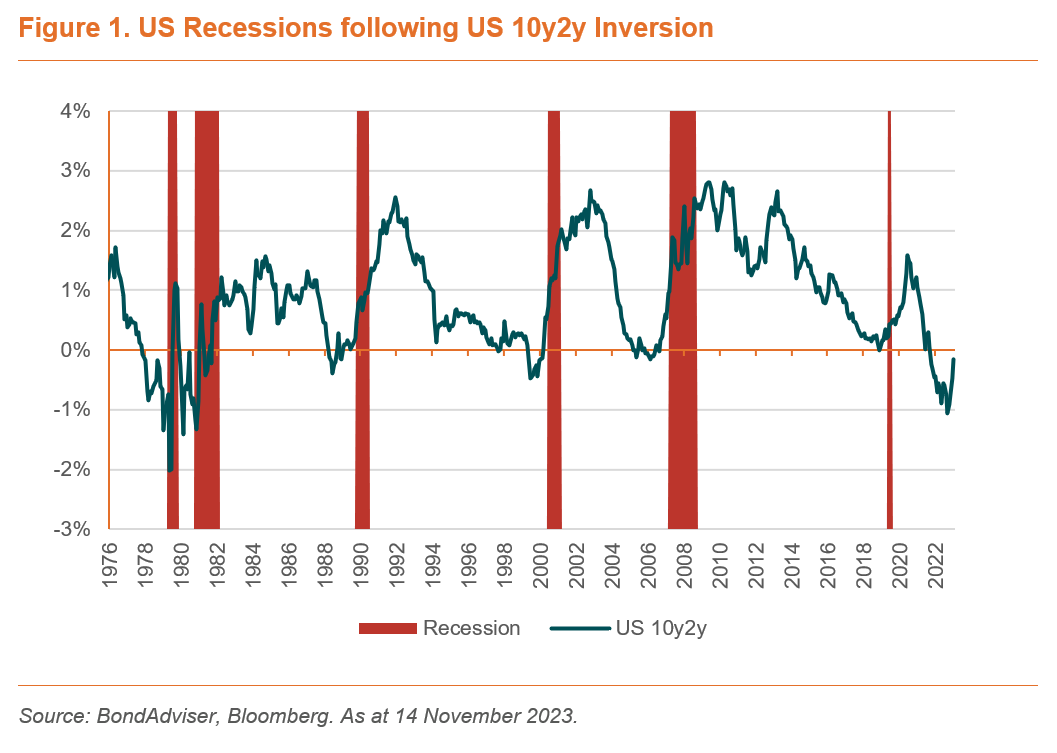
Given we are now past that average timeframe for recession post inversion, it is unsurprising to hear noise like “this time it is different”. Be cautious when you hear such folly. Here, here, here, here, and here are examples of such rhetoric prior to significant economic weakness and recession. Unfortunately, such examples are now making their way to the financial tabloid headlines.
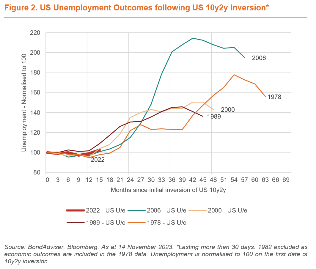
We do not think that this time is different. We have said that higher rates are like a python slowly suffocating an economy. Figure 2 shows that markets have been over their skis in predicting a 2023 recession – remember when some gave it a 100% chance. Instead, the lack of rise in US unemployment is perfectly consistent with prior timing post-inversion. Prior data suggests that it is reasonable for another six months of business as usual before the unemployment data starts to worsen quickly.
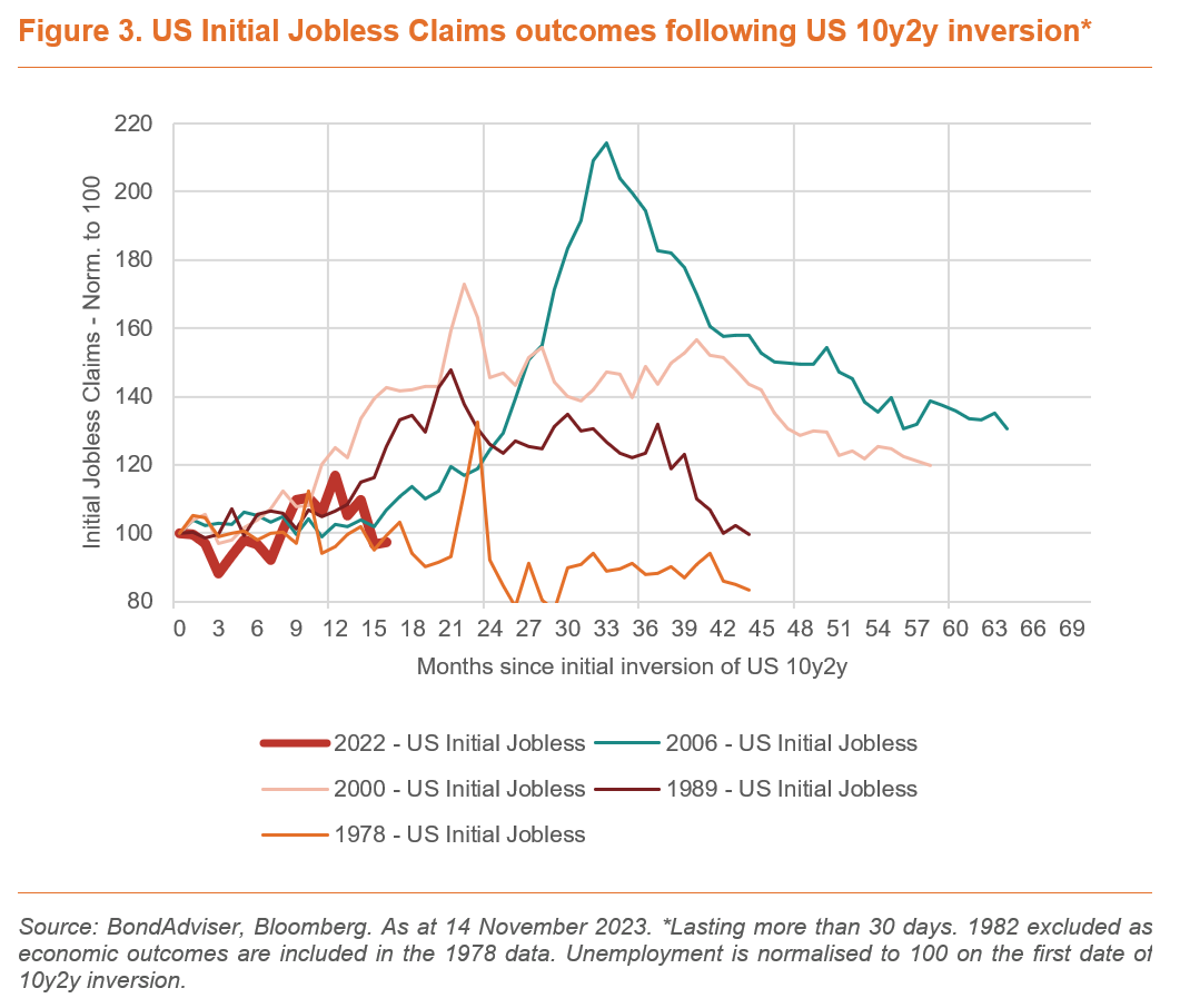
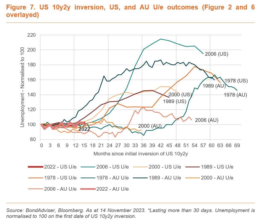
Figure 3 supports this assertion, looking at a similar but different measure in Initial Jobless Claims. A true co-incident data point that is updated weekly in the US. Figure 2-7 are all built in a similar way. The economic statistic is normalised at 100 on the first date of a 10y2y inversion. Excluded from the dataset is any inversions that lasted for less than 30 days (which often overlap included timeframes anyhow), and 1982 is removed from the dataset as it is included in the 1978 data.
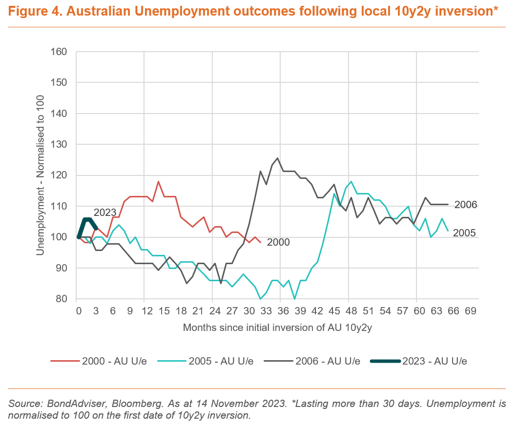
Figure 4 applies this logic to our local market, based on our Australian Commonwealth Government Bond (ACGB) yield curve. Disappointingly the conclusions are less clear as a function of less data (Bloomberg data for the 10y yield only goes back to 1999), but it does suggest it is early in our market to be predicting near-term material pain in the broader economy.
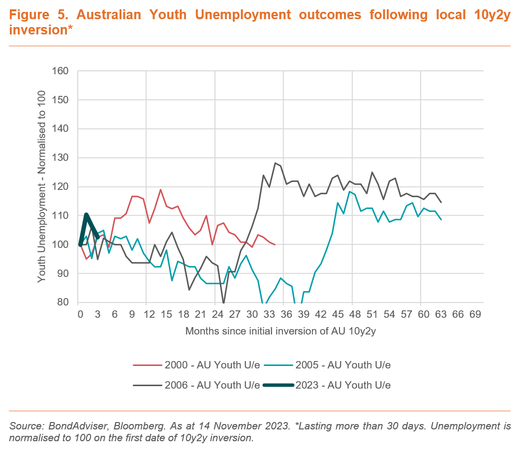
Australia does not have an initial jobless claims statistic like the US, so we have used youth unemployment instead – in what is hopefully a more leading indicator given young people are typically employed in discretionary sectors on casual contracts – in other words, it would be logical that they are the first affected. Figure 5 does not support this conclusion and the outcomes are very similar to Figure 4, in other words the same narrative is true – further time is needed before pain in coincident data.
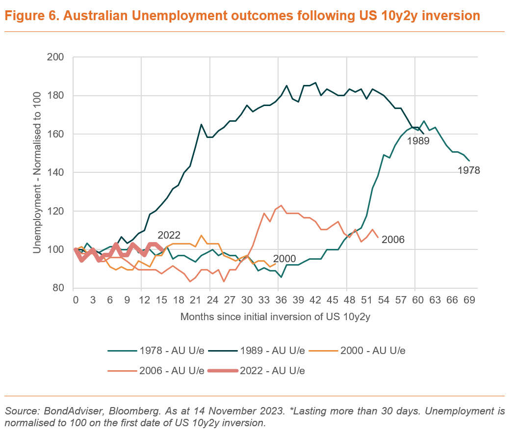
Given Australian yields correlated well to US yields, Figure 6 uses the US 10y2y inversion but Australian economic statistics. Only in 1989 did the data worsen in Australia quicker than where we are today. That data represented the infamous 1990 “recession we had to have”, where short-term rates rose over 7 percentage points from circa 10% since the early months of 1988.
Based on the 1978 and 2006 experiences, we could have another year’s worth of strong performance in our local economy. This aligns with our expectations that the Australian economy would lag the performance of the US economy.
We still believe that the US and Australia are heading towards a recession. But we think it will take longer for this to manifest in key numbers like unemployment. Our allocation orbital, in Figure 8, has actually been wound back to the right off the back of this analysis. We believe the worst of the monetary tightening is over, but that the economy is still being squeezed, and we view economic data as continuing to worsen. This means that we see cash rates staying high into the future, and we expect the transition of allocations moving from the lower left quadrant to the upper left quadrant late into 2024.
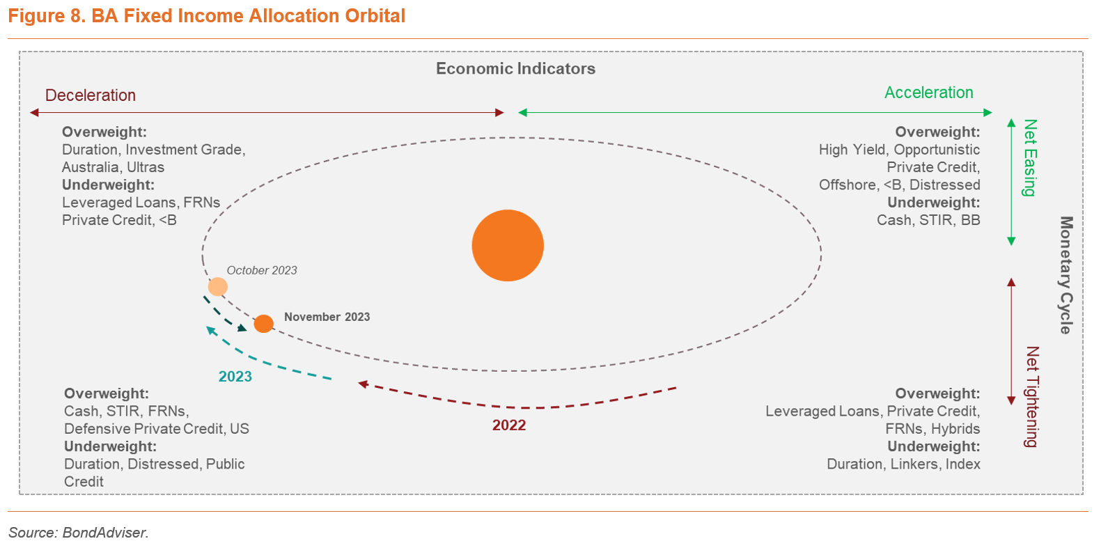
On duration, now is not the time to have zero, but it is not the time to fill your boots. The time is right to be rebalancing for those that have incurred losses. Now is a good time to watch grass grow as a 3mBBSW of 4.4% provides material cashflow carry and loss absorption capability on floating rate securities.
Click here to see some of Charlie’s recent video commentary on ausbiz.
